Product Design
Digerini
My Role: Product Designer
Collaborators: Ayato French (Full Stack Dev), Chad Thomson (Backend Dev), Shreya Kapoor (Frontend Dev/UX Researcher)
Tools: Figma, Qualtrics, Mural
Time frame: 6 months
"How do we filter out the digital noise from people's lives?"
Scam callers are everywhere. In February of 2021 alone, over 5.6 billion spam calls were made in the US. For my team's senior design project, we worked with a client to deliver the MVP of a product that would help monitor spam calls and block them from getting through — Digerini.
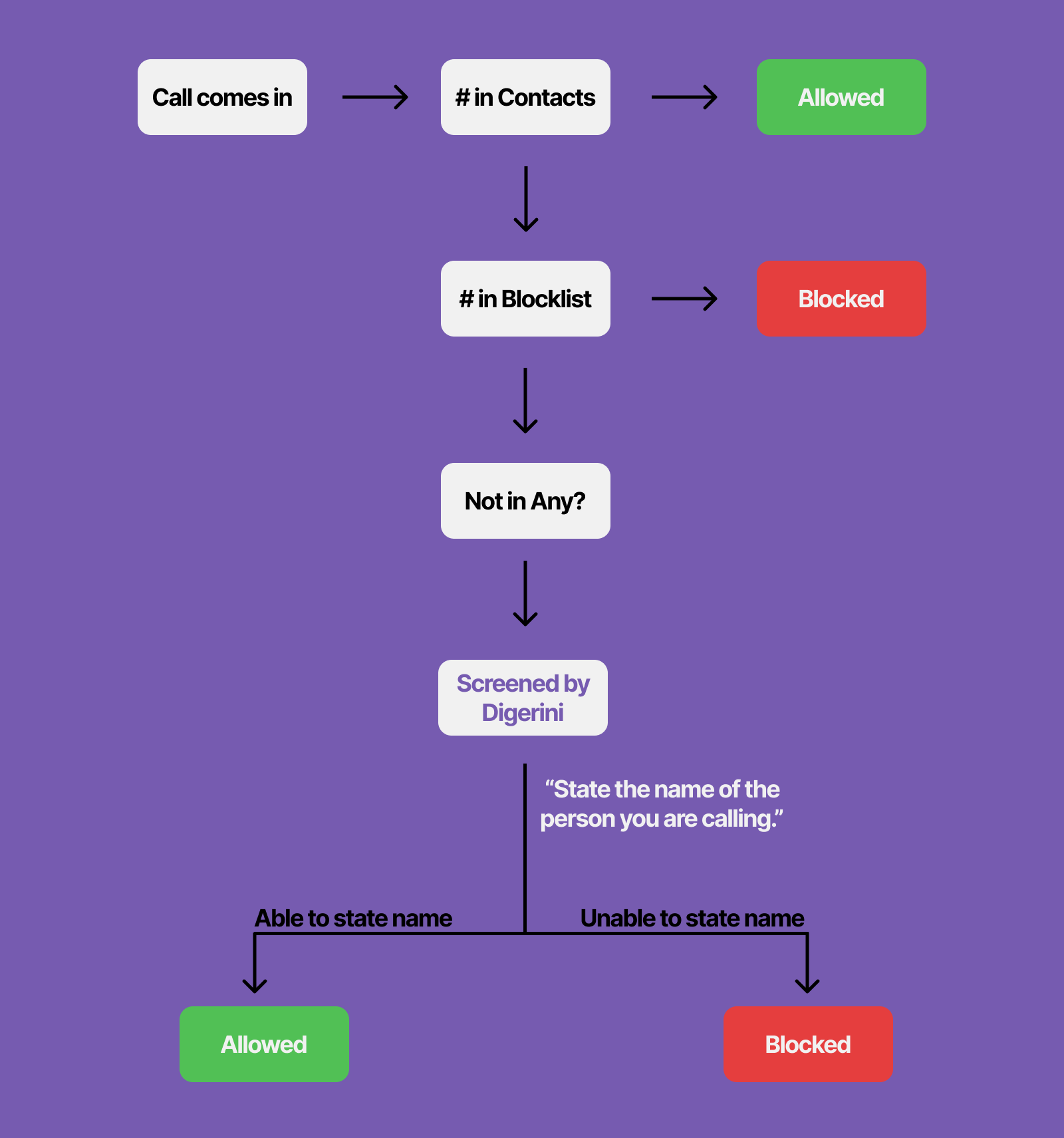
Digerini works by checking against multiple filters to see if an incoming call should be blocked or not. Numbers on your contacts list are automatically allowed, and numbers on your blocklist or commercial/government blocklists are automatically blocked. If the number is not on any of those lists, then it will go to Digerini to be screened. We worked under the assumption that if someone "real" is calling you, they would know your name. So, we screen calls by asking the caller to state the name of the person they are calling. If they are able to state the name, the call is allowed, but if they are unable to, then the call is blocked.
We developed a backend system that uses hotword detection using an API called Snowboy that works just like how Alexa works: it’s able to pick up a certain phrase in an audio stream, and we use that to detect a person’s name from the call audio.
My job was to figure out what this would look like on the user's end. I worked closely with the development team to scope out the project and figure out what features and requirements we needed to successfully deliver the MVP.
I worked with our UX Researcher, Shreya, to learn more about who exactly we intended this product for and dial in on our target audience. We created 3 personas to understand who we were designing for and who would actually use this product.
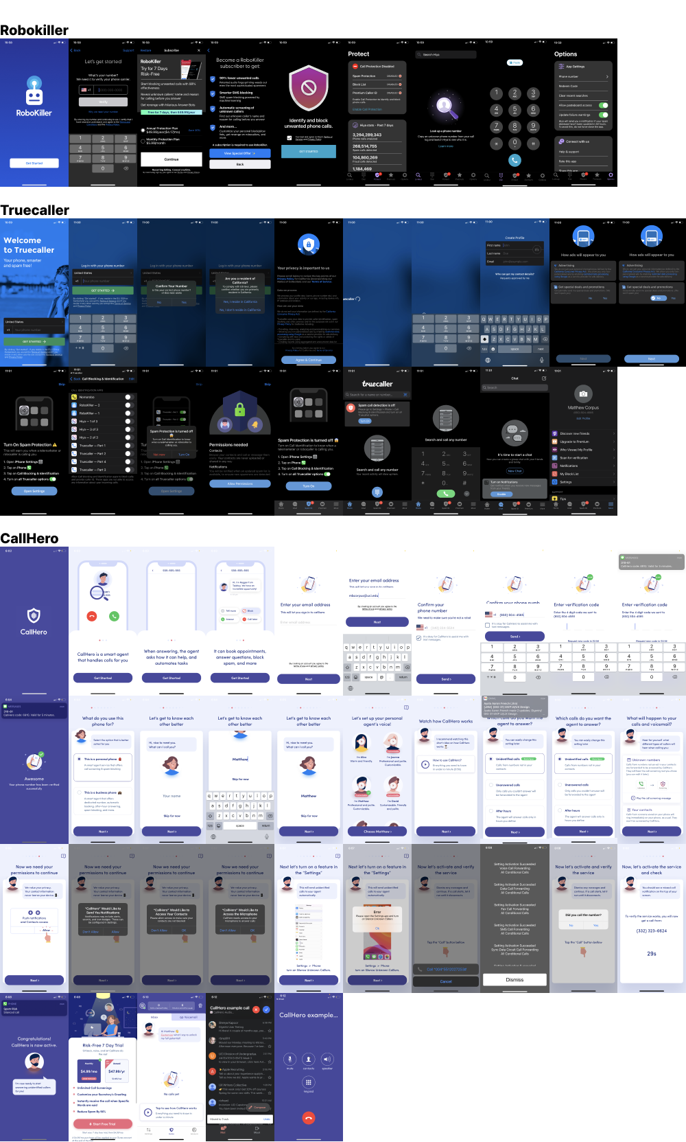
Once we created the personas, I looked at other spam call blocking apps to get inspiration from their UI and flows, which was helpful especially for the onboarding process, since there were some special settings that had to be set up for the backend system.

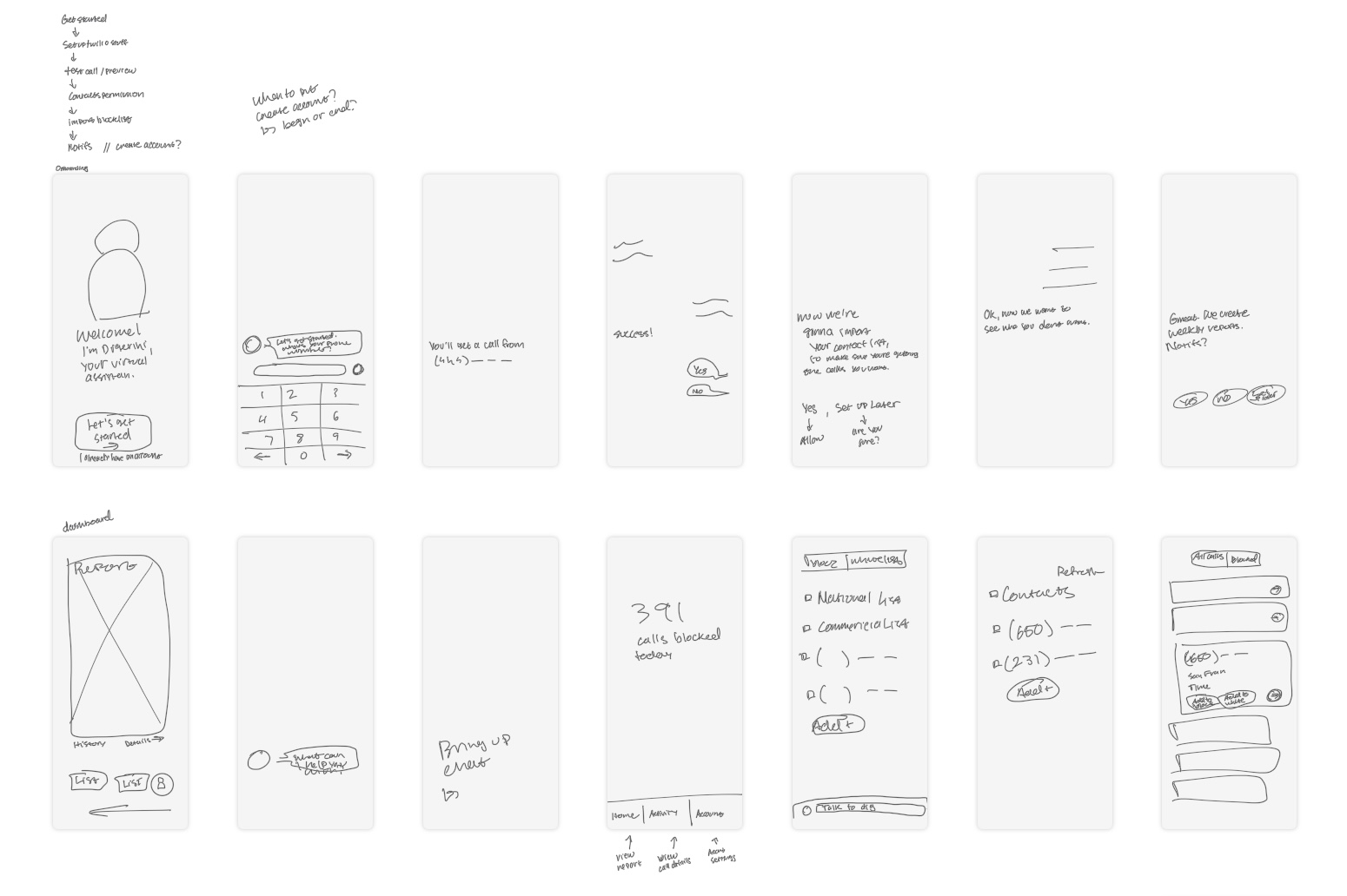
My first idea for the user interface was to create a chatbot interface. Our client envisioned Digerini to be a digital assistant, so I thought having the user “talk” to our app was a way to make the experience feel more conversational.
After exploring the idea more with our client and developers, we decided to go with a more traditional app interface, since we were only developing the MVP, and the chatbot feature could be a feature down the line.


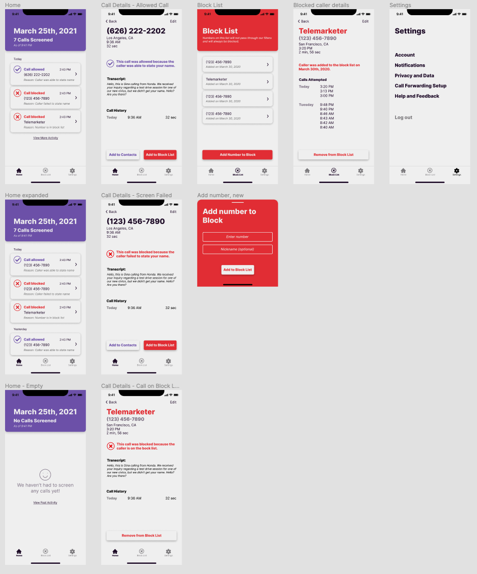
Statistics Dashboard
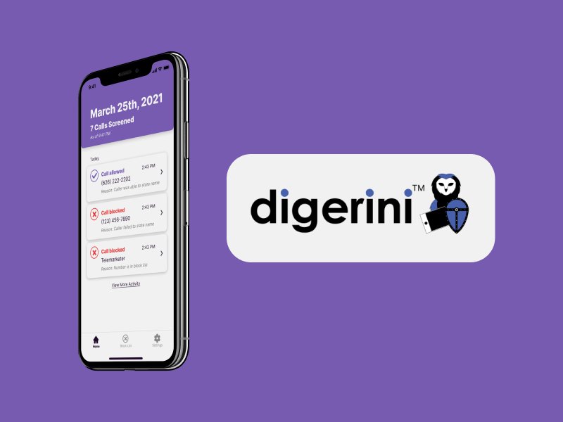
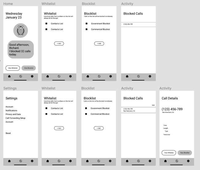
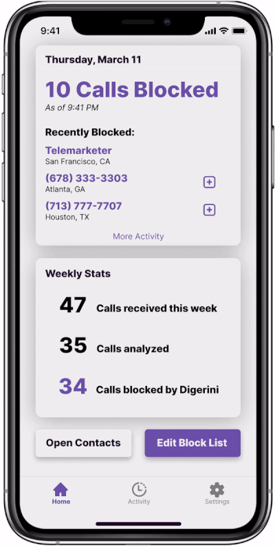
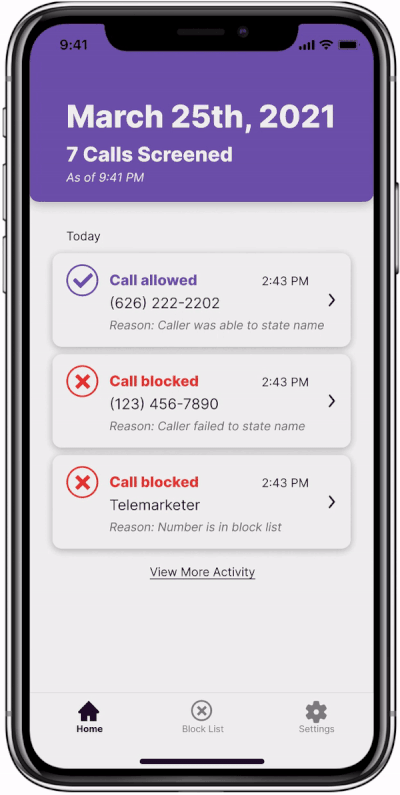
The home screen has a dashboard with quick view statistics that would inform the user of Digerini’s activity for the week, as well as the most recently blocked calls.
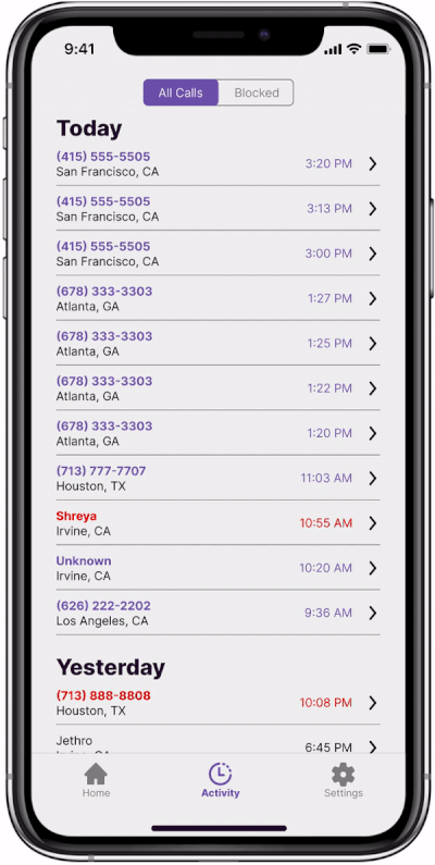
Call Activity
All call history is tracked, and can be viewed in the "Activity" tab. Each call could be expanded to view more details and options of what to do with that call. Purple meant that a call was blocked, red meant that a call was missed, and black meant that a call was allowed.
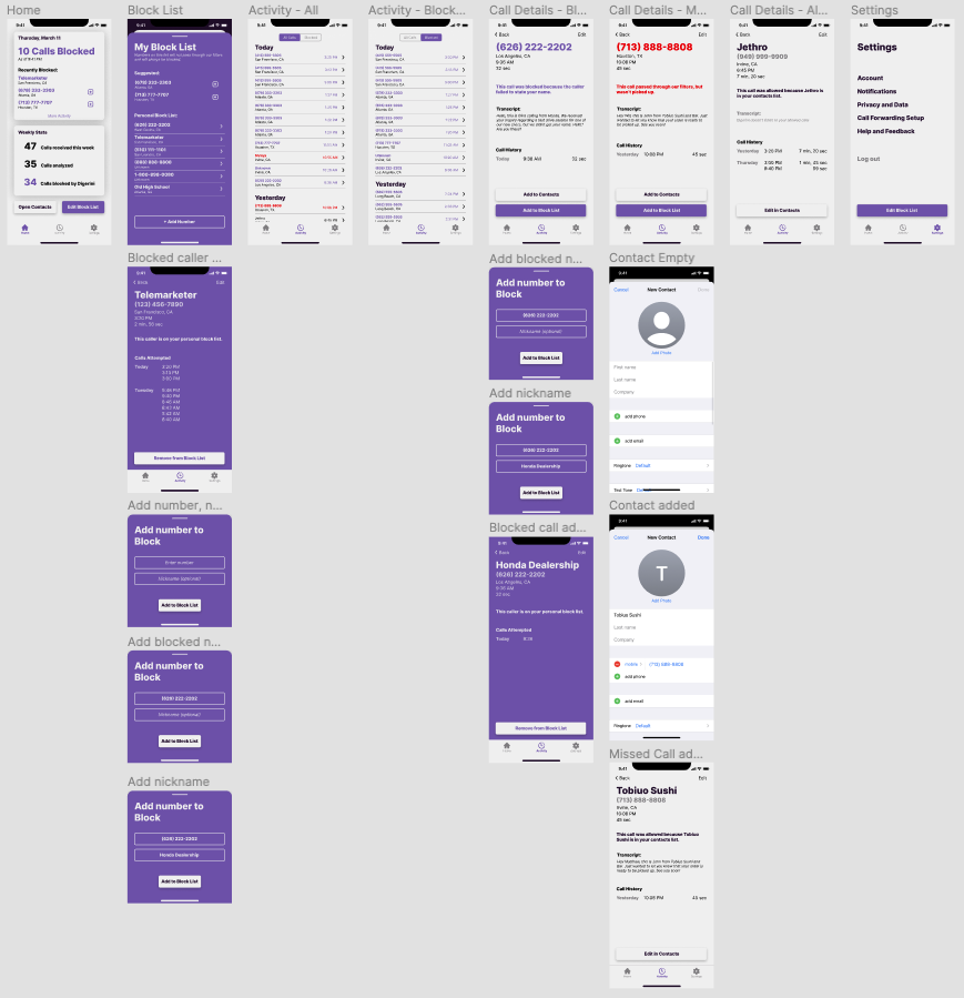
Blocklist
The blocklist was essential in giving users control over what calls were being blocked, as well as acting as aplace for users to add new numbers to their blocklist manually.
With a functioning prototype now in hand, it was time to gather some feedback. Before handing off the design to the development team to be built, I decided to conduct usability tests to gather feedback and see if any changes needed to be made. I created a protocol to conduct usability tests, asking users to complete certain tasks and walking me through their though process. I conducted four tests, and kept track of the data using Mural.
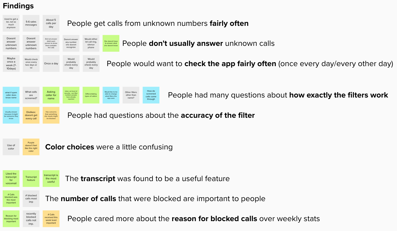
In addition to the findings from the usability testing, the development team requested for the design to be more scaled back, as we had overestimated the scope of what could be built in the timeframe that we had. Taking all of this into consideration, I had two main objectives for the final design:
As a result, the final version of the prototype is a much more simplified and streamlined version of the app, which more closely aligns with the MVP requirements.
Onboarding
I designed a simple onboarding flow that was previously missing. It was necessary to set up users to use Digerini, as well as gather the necessary information needed for our backend to properly operate.
Color
In our usability testing, it was mentioned that the colors were confusing. We found that purple was more associated with being positive or good, and red was more associated with meaning bad. I updated the colors in the final design to reflect this, with purple indicating an allowed call, and red indicating a blocked call.

Streamlined Home Screen
The main screen no longer displayed statistics, but instead the most recent calls, since our usability testing found that people didn't really care for the statistics and were more interested in which calls were blocked. This also simplified the interface and more closely aligned with the features needed for the MVP.

Working with a cross-functional team for the first time and for a real client involved a huge learning curve from my past design projects. Adopting the agile process in our workflow and working in sprints was a huge help to our project management and accountability.
It was great getting to own the design process as I was the sole designer, and seeing the design come to life was awesome. Being in charge of design also meant that I had to take responsibility and make sure that I was gathering enough feedback and checking in with different stakeholders throughout the process.