UX Redesign
Disneyland App
My Role: UX Researcher + Designer
Collaborators: Chenyuan Zhang, Christine Trinh, Juleanne Palad, Thomas Kang, Henry Pham
Tools: Figma, Google Surveys
Time frame: 3 months
This project was originally for Informatics 132 at UCI, a class that taught UX research and design methodology, and focused on the tools and methods that could be applied at each step of the redesign process. As a Disney fanatic, I frequented the park almost every weekend, and somehow convinced my team to redesign the Disneyland theme park app. This was an unsolicited redesign, we had to do some of our own digging to find out what the problem was.
I collaborated with the others on my team to research and evaluate the current app, and eventually used those findings to create my own high-fidelity mockup of the redesigned interface.
"It's a bit overcomplicated for what it's meant to be"
From our research and testing, we found that guests visiting Disneyland primarily used the Disneyland app to find their way around. However, the current version of the app is not very efficient. This can traced back to cognitive overload, with poor organization being the main problem.
Don't worry, from our research, we have receipts to back it up.
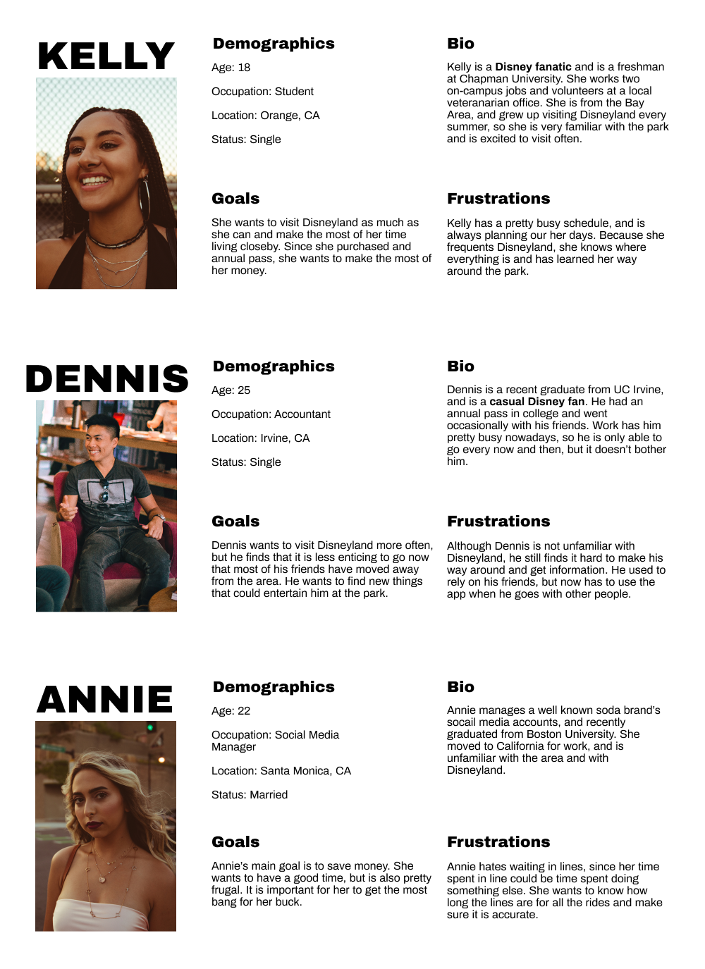
We started by creating a survey to gather some data on our users. Our target audience for the redesign were 18-24 year old college students, since that was the demographic we had the easiest access to. In addition, we created 3 personas based on our target audience, to help guide our design. We also performed a competitive analysis by looking at competing them park apps which aided in our design ideation.
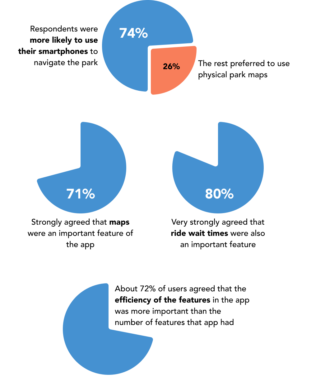
Essentially, our survey revealed that maps were important to users and that users valued its efficiency. So, we decided to narrow our focus to look solely at the map feature.
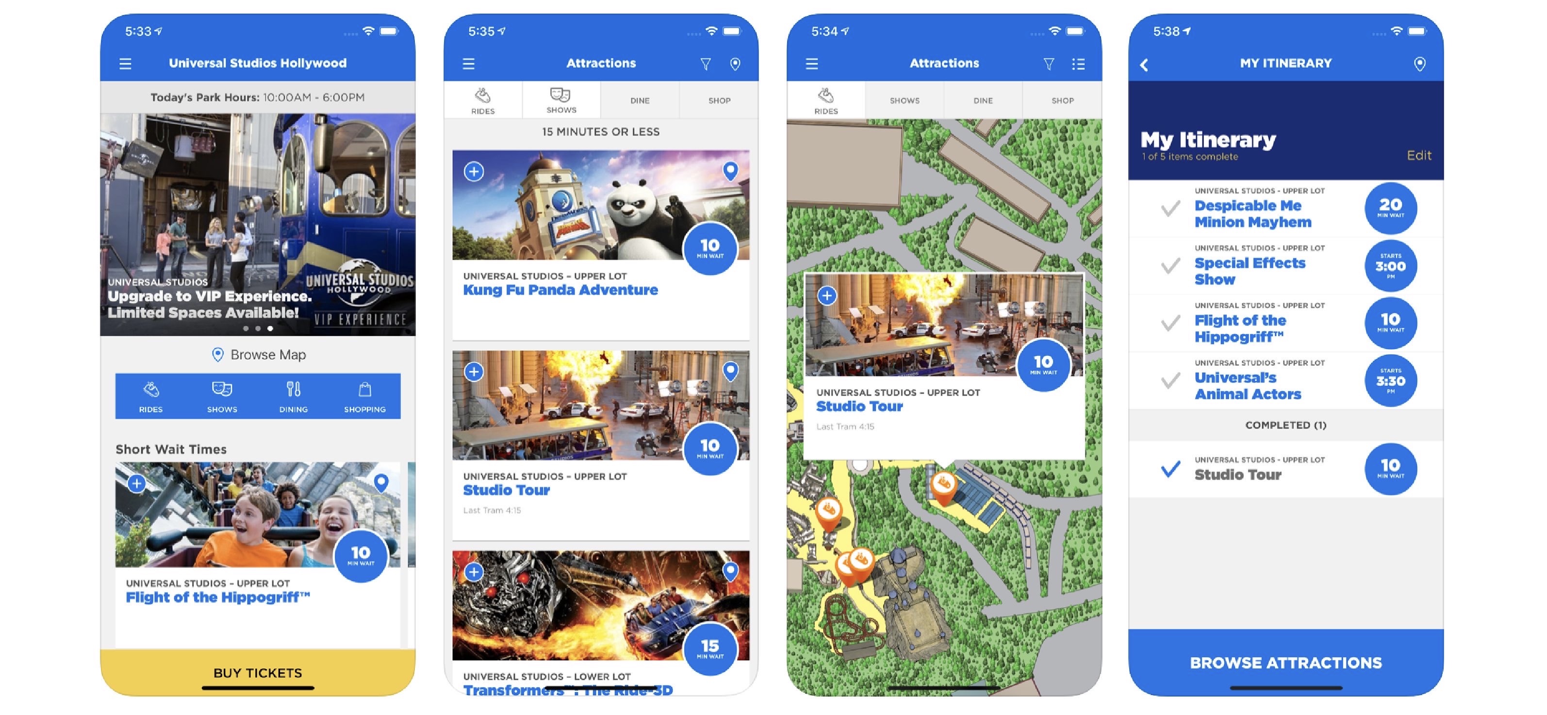
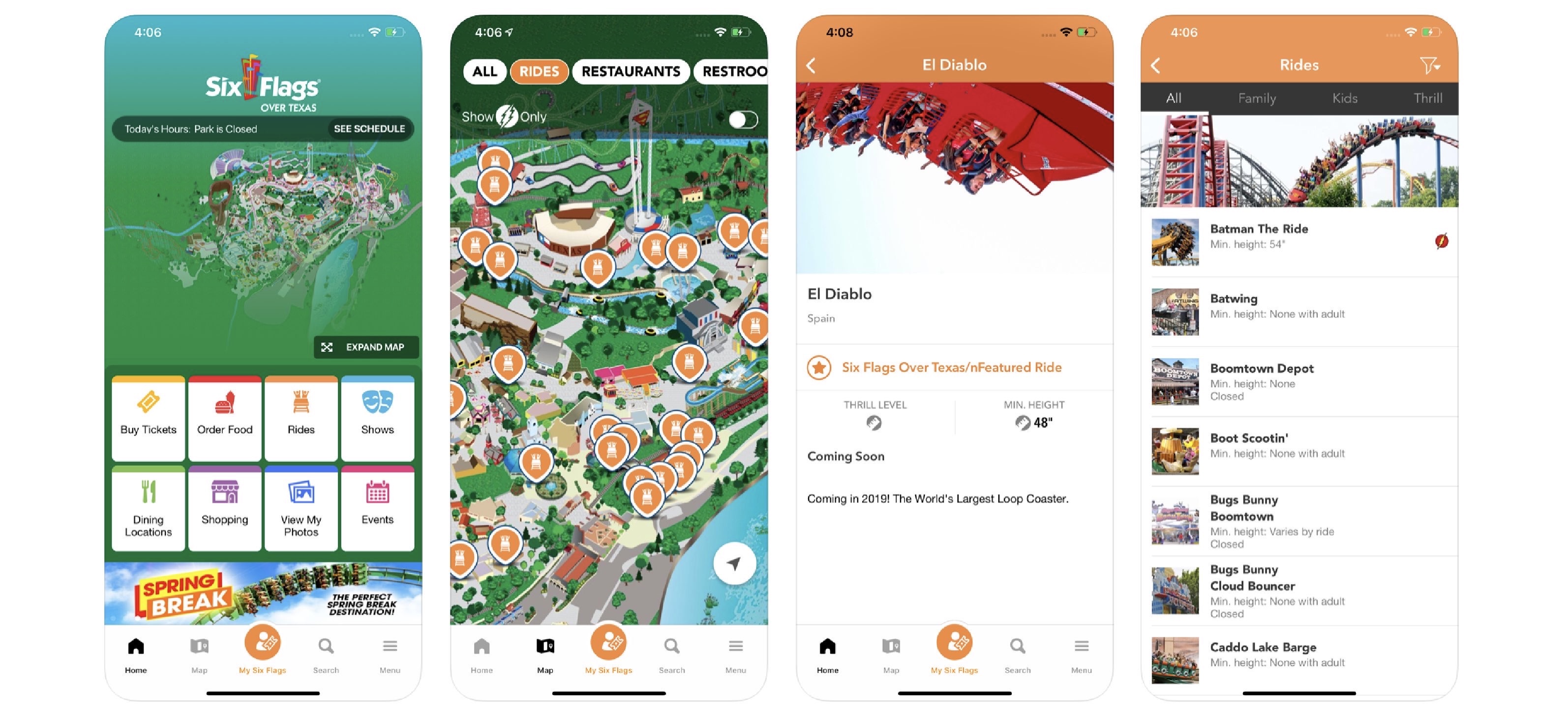
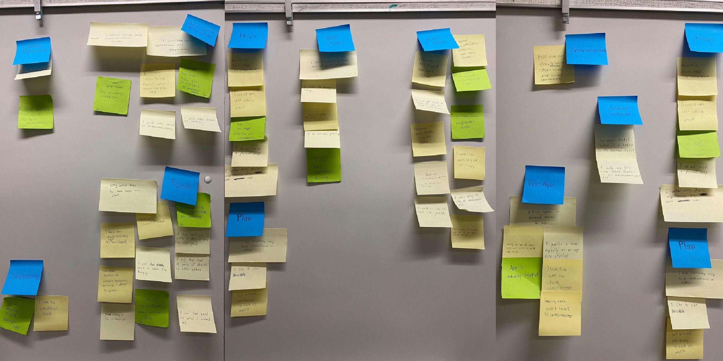
To discover current map’s pain points and figure out what the problem was, we decided to conduct usability tests. We developed a testing protocol and gave our users several tasks to complete, ranging from finding the current ride wait times to finding which rides are eligible for FASTPASS. Each team member moderated their own test, and afterwards, we came together to create an affinity diagram from a total of 6 interviews.
Through our usability testing, we were able to synthesize our findings and figure out 3 main problems with the app:
The information hierarchy was unintuitive
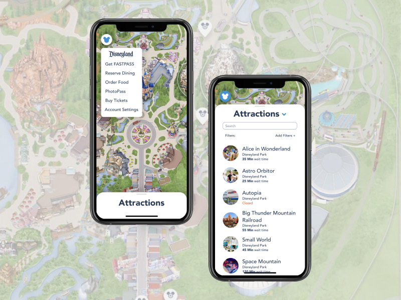
Most people only clicked on either the map or the search tabs in the navigation bar, and didn’t even bother with the home or hamburger tabs. If something they couldn’t find what they were looking for on the map, they defaulted to just searching for it, which was not always successful.

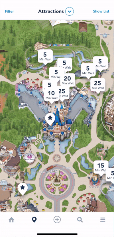
There was too much on the screen at one time
People were overwhelmed by the amount of information on the map. This caused some features to be hidden, with many users unaware of the “categories” drop down or the “show list” button.
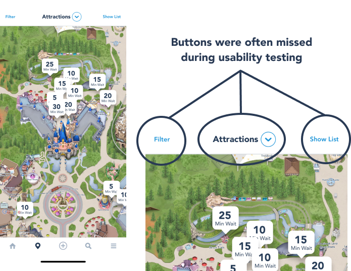
Filtering was messy and unorganized
When people used the filters to find certain rides or locations on the map, they found that it was poorly grouped and unorganized. Some users didn’t even bother to try and use the filters because they were so confusing, and the ones who did weren’t very successful in completing the task.
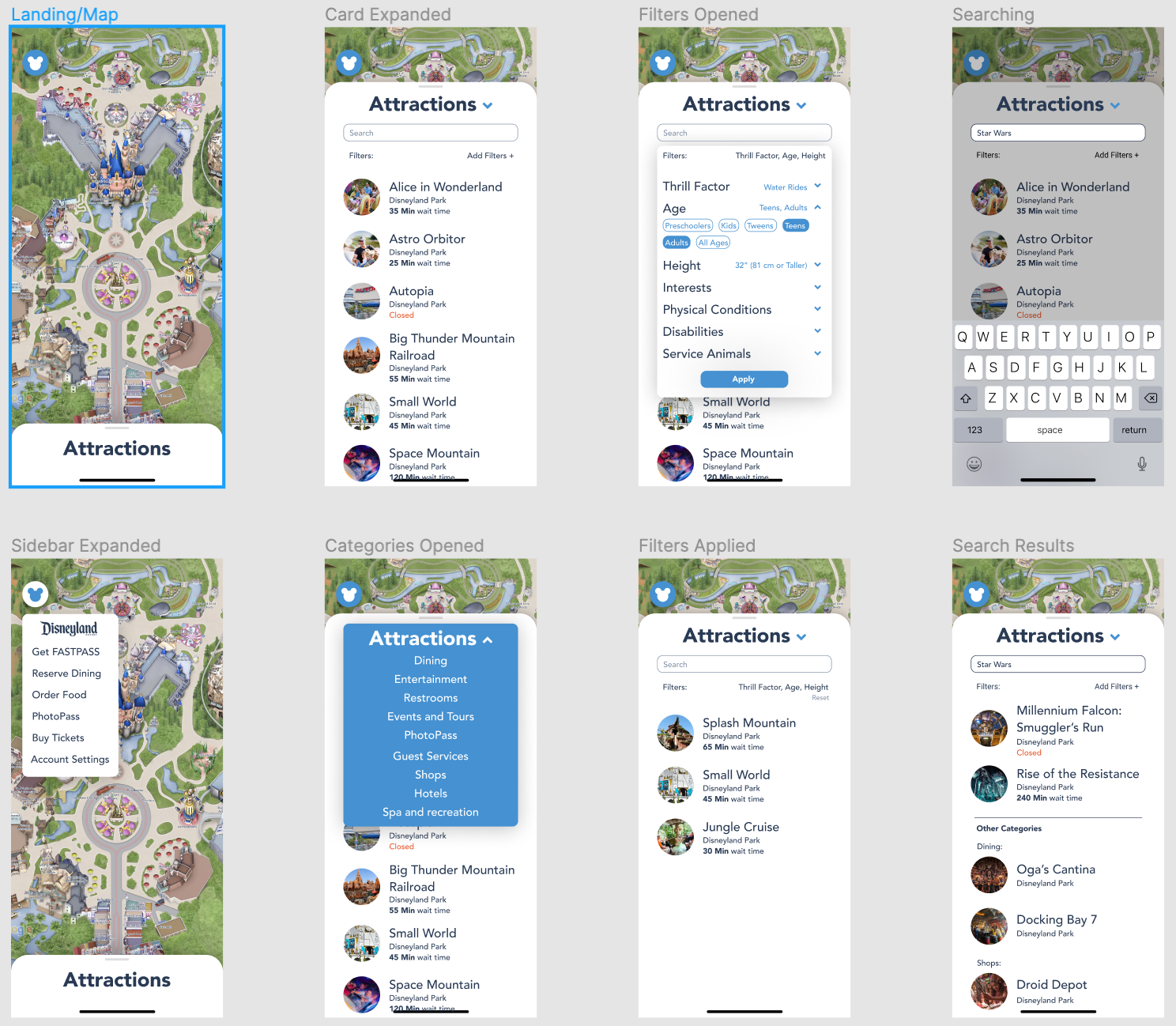
Now that I had a solid understanding of the problem space, I started to sketch out ideas for potential solutions, making sure the main components of the original map (filtering, categories, search) were present in the new design. Because the main problem that we found was with the map's functionality, I only focused on redesigning the experience for that feature.

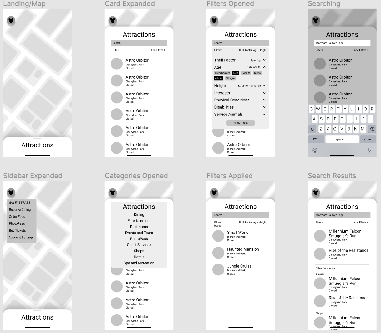
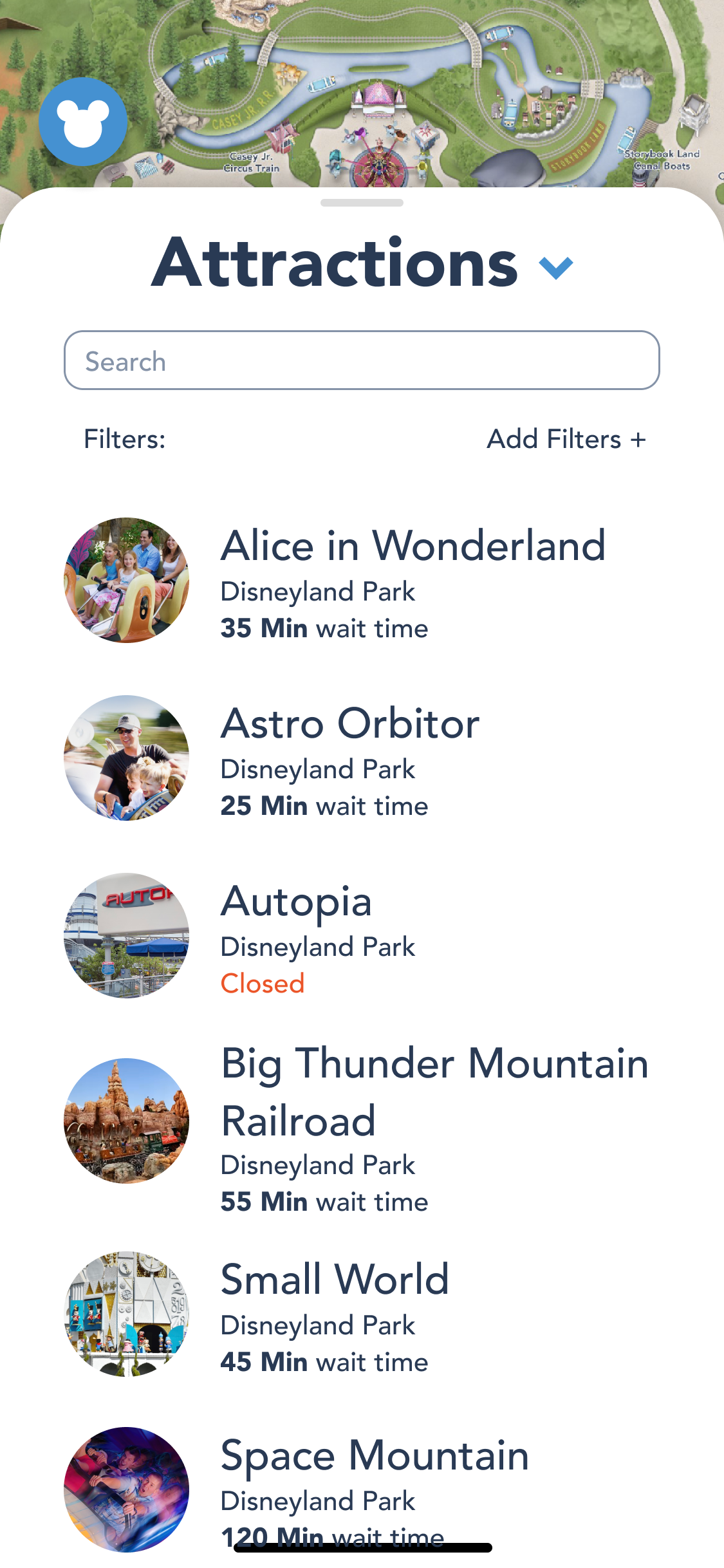
I wanted to keep as much of the original UI as I could in the redesigned high-fidelity mockup, to keep in line with Disney's branding. Overall, I focused on redesigning the structure and user experience while maintaining the visual identity of the original app.
Floating Menu Button
I wanted to have a more streamlined user experience, so I removed the tab bar completely and replaced it with a floating button that displays the menu items. This made the map be the first and most prominent screen, and made it the focus of the app, since our research showed that it was the feature people cared about the most.

Categories, Filters, and Search was consolidated in one place
The categories, filters, and search were all moved into a card that can be pulled up from the bottom of the screen, keeping all the functionality in one place. The categories was now more prominent and its dropdown was better indicated, which was an issue we found during user testing.
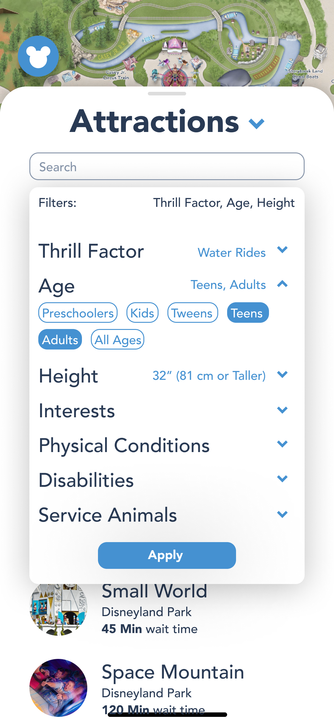
Reorganized filters
Many users found the filters and categories to be overwhelming and unorganized, so I designed dropdown filter categories that would hide each individual filter itself until the user clicked into it, which minimizes the amount of information on the screen and reduces cognitive overload.
A lot of our initial research was misguided, and we ended up collecting random bits of information that we never utilized. While it’s always nice to have more data than needed, it somewhat distracted us from the essence of the problem, which was the cognitive overload of the map. In addition, I would have liked to test our redesigned system to validate my design decisions and see whether or not the changes actually made a difference.
Overall, this project provided me with a solid foundation in the UX process, and the fact that it was all about the Happiest Place on Earth made me pretty happy too.